• PROJECT GALLERY
  • ABOUT
  • Contact
  • Log-in
Menu

Portfolio

Daniel Ramer
  • PROJECT GALLERY
  • ABOUT
  • Contact
  • Log-in

Seasoned Designer with over two decades of expertise in motion graphics, branding, and leadership. Proven track record in guiding teams to create compelling digital content. Deep industry knowledge and strong client collaboration skills. Click into the tiles below to see more about each project.

Pushpay Summit 2019

In 2019, Pushpay launched a live two-day user conference, hosting 1,300 attendees, comprising both customers and prospects from across the country. The event featured five stages across multiple tracks.

The primary objective was to rebrand the event to align with our core brand at the time, creating a unified experience throughout the event space, providing a meaningful learning experience for the attendees, and implementing a smooth navigation system for the rotating events. Additionally, I was responsible for producing the event presentation designs and overseeing the stage design. We also planned a product launch for the second day, introducing our new app features, Dynamic Home Screen, and Rich Push Notifications, necessitating a strategy to generate excitement for these launches.

This marked the fourth in-person conference I led the design for. Initially, I requested extensive floor plans and photos of the event space. Working closely with the event manager, we strategically positioned various stages. Concurrently, I used event space photographs to create photorealistic renderings of event booths, signage, and decor. These concepts were presented at our weekly steering committee meetings, providing our CMO with a clear and up-to-date progress report.

Recognizing the diverse interests of the five user personas attending the event, I proposed color-coding each persona: red for leadership, yellow for communications, green for finance, blue for technology, and slate for the Pushpay User track. We provided a key on the back of the event badge and indicated the attendee's persona on the front. Additionally, attendees received a pair of event-branded sunglasses in their persona color. Wayfinding on maps, signage, and the in-app experience all corresponded with the event's color scheme. I also oversaw the installation of all booths, signage, and staging, and facilitated the distribution of speaker presentations. Moreover, I assisted our CEO in rewriting his keynote speech.

For the Dynamic Home Screen product launch, I incorporated physical red app notifications into all our signage before the second day of the conference. Additionally, we distributed a storybook-style brochure with pop-out features, prominently featuring the Dynamic Home Screen.

The result was a fantastic user experience, significantly enhancing our perceived value to customers and attracting a 70% prospect attendance rate.

Pushpay Summit 2019 Recap
summit19-01.jpg
summit19-06.jpg
summit19-03.jpg
Summit omni.jpg
summit19-05.jpg
summit19-07.jpg
Summit Sign.jpg
summit19-04.jpg
summit19-08.jpg
Summit wayfinding.jpg
Summit booth.jpg
summit19-02.jpg
summit-gif-600x338.gif

Transforming TOMS: A Design Revolution

When I began my journey with TOMS, their product line was centered around the immensely successful Classic, available in a variety of colors and textures. The brand had garnered a dedicated following on college campuses, driven by their ONE FOR ONE promise to donate a pair of shoes to someone in need for every pair sold.

The challenge was to expand the collection while preserving the signature aesthetic of the iconic Classic.

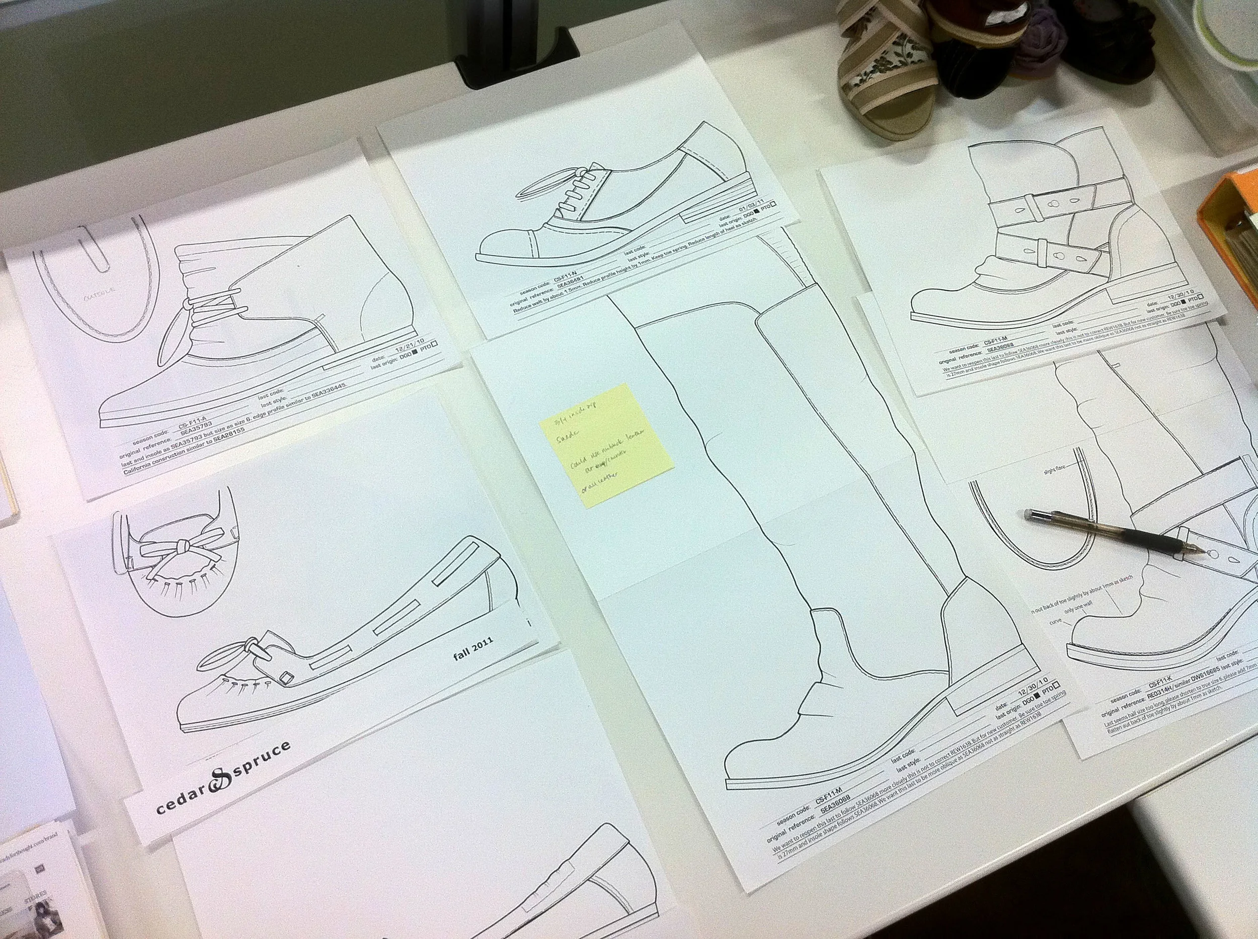
I spearheaded a transformative project that revolutionized their product line, working directly with founder Blake Mycoskie. This collaboration expanded the brand's offerings, introducing bestselling styles that have become iconic in the footwear industry. Notable among these are the Calypso Wedge, Tiny TOMS, and Cordones, each bringing a unique flair and enhanced functionality to the TOMS collection.

The Calypso Wedge: Elevating Comfort and Style

The Calypso Wedge was designed to blend comfort with sophisticated style. This popular wedge offered a new dimension to TOMS' traditionally casual line, appealing to a broader audience seeking both elegance and ease.

Tiny TOMS: Big Impact for Small Feet

Tiny TOMS brought the brand's beloved designs to children's footwear. Crafted with the same care and attention to detail as the adult versions, these shoes provided both comfort and durability for little feet, making a significant impact in the kids' market.

Cordones: Versatile and Trendy

The Cordones style introduced a versatile option that seamlessly transitioned from casual to semi-formal settings. With its easy-to-wear design and contemporary look, it quickly became a favorite among TOMS enthusiasts.

A Collaboration of Innovation

Working with Blake Mycoskie, I infused the TOMS product line with innovation and diversity. Each new design maintained the brand’s commitment to quality and social impact while attracting new customers and satisfying loyal fans.

Conclusion

This project not only expanded TOMS' product offerings but also reinforced the brand's position as a leader in the footwear industry. By introducing the Calypso Wedge, Tiny TOMS, and Cordones, we successfully met the evolving needs of our customers, ensuring TOMS remains a go-to choice for stylish, comfortable, and socially responsible footwear.

For more information about TOMS and their mission-driven products, visit TOMS official website.

Colorups+copytoms-.jpg
 The original  TOMS  Wedge (designed as a gift for Oprah Winfrey)

The original TOMS Wedge (designed as a gift for Oprah Winfrey)

sketches 02toms-.jpg
Colorupstoms-.jpg
shoestoms-.jpg

Cedar & Spruce

Cedar & Spruce was a branding and product design project for Report Footwear and Steve Madden. The goal of the project was to design a line of sustainable fashion footwear and a build a brand that embraces the environmental ethic of taking care of the place we all love and live. The ampersand logo ties the hidden C and S initials together in a unity of elements.

S and C cover.jpg
C and S- logo.png
Pencil-concepts.jpg
C-and-S--logo-usage.jpg
fit page.jpg
C and S box one A 1200.jpg
C and S box one 1200 x1200.jpg
display.jpg
sketches.jpg
photo[1].JPG
photo[3].JPG
photo[4].JPG

Space Force Identity Proposal

In 2020, a new division of the United States armed forces was proposed: Space Force. Initially lacking a seal, emblem, or identifying marks, I seized the opportunity to create four proposed concepts and submitted them for consideration.

Each design was meticulously crafted to reflect the time-honored tradition of incorporating our national symbols, communicating the quintessential American attributes. The American eagle represented independence, while the 13 arrows symbolized strength of arms. An olive branch with 13 leaves signified our commitment to peace, and a shield with 13 stripes epitomized unity in defense, all underscored by 13 stars representing our founding colonies.

Ultimately, a design featuring a delta ensign was selected. This emblem, first used in 1961 by the USAF Space Command, provided a seamless link to the Space Force's legacy rooted in the United States Air Force.

A Higher Calling 
A Higher Calling 

In this design, America's eagle has broken free of gravity's grip.
It is now a sentinel perched high upon Earth's canopy to defend America's liberty.

Reaching for the Stars

With the eagle's outstretched wings, upward posture, and both the moon and Mars as backdrops,
this design depicts freedom's far-reaching aspiration beyond the confines of this world.
It is named for a song of the same name from Johnny Cash's 1972 album, America.

The Sky's the Limit
The Sky's the Limit

This design juxtaposes the power of liftoff rocket thrust with a planetary orbital ring to
communicate there are no reaches too far afield to keep us from our mission. 

Re-entry Eagle (Coming in Hot)

The elements in this design represent the rupture of the hypersonic barrier. The 13 red and
white rays stretching back from Earth's atmosphere take the place of the shield that ordinarily
adorns the eagle's chest. This design communicates swift and decisive action. 

Space Illustration

Amid the emergence of AI-generated art, I embrace a timeless, hands-on approach to craft optimistic, futurist illustrations. Each piece is meticulously hand-painted, blending human creativity with insights from aerospace engineers and astrophysicists to envision a bold, inspiring future.

Propaganda Art (27).jpg
Propaganda Art (26).jpg
Propaganda Art (10).jpg
Propaganda Art (2).jpg
Penny For Space Poster template (2).jpg
Penny For Space Poster template (13).jpg
Penny For Space Poster template (4).jpg
Penny For Space Poster template (5).jpg
Propaganda Art (3).jpg
Propaganda Art (13).jpg
Penny For Space Social Poster.jpg
Propaganda Art (6).jpg
Propaganda Art (18).jpg
Propaganda Art (8).jpg
Propaganda Art (20).jpg
Propaganda Art (21).jpg

Artemis Illustrations

This three-poster illustration series was created for NASA's Artemis Program to inspire young girls with the mission of landing the first woman on the lunar surface by the decade's end. The posters showcase the NASA Space Launch System (SLS) and Orion capsule launching toward a full moon, embodying the program's ambitious vision. The final poster draws on mythology, featuring Artemis, the goddess of the hunt and sister of Apollo, firing her bow toward the heavens to evoke the spirit of exploration and adventure.

Artemis psters mock up.jpg
IMG_6873.jpg
IMG_6976.JPG
Artemis psters mock up 03.jpg
IMG_7076.JPG
Artemis psters mock up 02.jpg
One+Lunar+Day.gif
Moon+Phase+new.gif
The Worlds Preview.jpg

The Moonsteaders Illustration

This children’s books series is set in the spacefaring society of the near future and is centered around several pioneering families. Imagine a midcentury-modern space-age Little House On The Prairie with a focus on hard work, adventure, and exploration of the unknown.

Available on Amazon.

moon book cover Have a new baby.jpg
Have a New Baby Mock Up.jpg
16x9-3-4.jpg
16x9-5-6.jpg
16x9-7-8.jpg
Have a New baby 03.jpg
moon book cover Space ABCs.jpg
The Moonsteaders Space ABCs.jpg
16x9SPACE-ABCs-6.jpg
16x9SPACE-ABCs-Q.jpg
16x9SPACE-ABCs-U.jpg
moon book cover Why we explore.jpg
Moonsteaders Why We Explore.jpg
16x9Shackleton.jpg
16x9crator-city.jpg
16x9Asteroid.jpg

Pushpay Infographics

Creating engaging infographics for echurch, a brand dedicated to serving churches, involves translating complex ideas into visually compelling designs. By simplifying data and key messages, these infographics help church leaders connect with their communities, making it easier to communicate the impact and vision of their ministry.

How to choose an online giving tool for your Church-01.png
Church-website-must-haves.jpg
How to write a church budget 150-01.png
Insanely Practical Ways to Increase Church Giving-01.png
Church Planting-01.png
Sojourn Heights-01.jpg
Sojourn Heights 12-05-16-as one.png
Shelter Cove-03.png

Textual & Floral Design

I developed a range of textile and pattern designs for apparel and accessories, collaborating with several well-known brands. These designs were created for a diverse lineup of companies, including Roxy, r2, TOMS, Aeropostale, LEVI'S, and NY&Co, among others. Each collection was tailored to fit the unique brand identity and target audience of the respective brands, ensuring that the patterns aligned with current trends while maintaining their distinct aesthetic. The designs were applied across various product categories, from clothing and footwear to accessories, contributing to a cohesive brand experience.

Bikini-01.png
Artboard 1 copy 2.jpg
Bikini 02.png
Artboard 1 copy 3.jpg
bikini 03.png
Artboard 1 copy.jpg
Bikini 04.png
Artboard 1.jpg
Bikini 05.png
BKI-TEST.gif

Elsom Rosé

“A Rosé for the red wine lover.” Designed for Elsom Cellars, the Elsom GSM 2017 Rosé wine label was a request to depart from Elsom’s classic black and gold label. I worked closely with Jody Elsom to create something clean and iconic for one of their most popular wines.

Product_elsom_05.jpg
elsom-03.jpg
elsom.jpg
elsom-02.jpg
elsom-04.jpg

Content Marketing

This is an example of a typical content-marketing campaign designed for echurch. The full campaign would include social covers, ads for Facebook and Twitter, eblasts, email nurture images, display ads, website resource images, landing page images, blog post CTA, and the ebook.

content marketing-01.jpg
content marketing-02.jpg
content marketing-03.jpg
em-image-mission-trip-drip-01-1200x628-c.png
em-image-mission-trip-drip-02-1200x628-b.png
em-image-mission-trip-drip-02-1200x628-c.png
phone-ebook-cropped.gif
Other ebooks I have designed
everybook.gif

Cascade Country

The Cascade Country logo was developed for Aaron Crawford’s Pacific Northwest country music recording label. Taking inspiration from the rugged wilderness and unchanging evergreen.

Cascade Country final_Concept D black.png
color story 01.jpg
Cascade Country final_Concept D photo 1.png
Photo 1.jpg
Photo 2.jpg
Photo 3.jpg
Cascasde-hat-01.jpg
Cascasde-hat-02.jpg
Cascade Country final_Concept D photo 2.png
T Shirt B1 copy.jpg
T Shirt B4.jpg
Tank top A1-new.jpg
Tank top A3.jpg

Give Like God Gives

The logo for Give Like God Gives was designed for a Pushpay marketing campaign centered around ten videos. With its central design taking elements from the classic cathedral rose window. Click here to see one of the videos.

Give-Like-God-gives-logo.jpg
Give-like-God-Gives-colors.png
Give-Like-God-Gives-useage.jpg
Give-Like-God-Gives.gif

The Fieldhouse Project

The goal of this logo and branding design was to give dimension and identity to The Fieldhouse Project and its efforts to facilitate Education and Community Development with Organized Athletics as the means of freeing children from generational poverty.


1-N-fishing-boats-11 cover.jpg
FHP-colors.png
Feildhouse-04.jpg
Feildhouse-03.jpg
Feildhouse-05.jpg
FHP-logo.gif

Northwest School for Deaf and Hard-of-Hearing Children (NWS)

The concept of the NWS’s open book logo stems from the essential importance of reading to education. It is especially important for those who are deaf or hard-of hearing to learn how to read. Most individuals who are deaf or hard of hearing read below the third grade level. NWS has committed to a focus on reading, amplified listening, and signing ”English As Spoken” to help children both succeed and surpass educational expectations. The pages of the open book logo spell the initials NWS.

NWS-cover.jpg
NWS-logo.png
Identity-01.png
At a glance.jpg
NWS-04.jpg
sign.png
NWS-05.jpg
prev / next
Back to PROJECT GALLERY
cover.jpg
14
Pushpay Summit 2019
Colorups copytoms-.jpg
5
TOMS
12
Cedar & Spruce
project-13 copy.jpg
4
Space Force
Starship Advent Mars.jpg
16
Space Illustration
IMG_6874.jpg
9
Artemis Illustration
moon book cover Have a new baby.jpg
16
The Moonsteaders Illustration
Practicing-Generosity-as-an-Act-of-Faith-Facebook-size.jpg
8
Pushpay Infographics
Artboard 1 copy 4.jpg
10
Textual & Floral Design
elsom.jpg
5
Elsom Rosé
phone-ebook-croppedcover.jpg
9
Content Marketing
Photo 1.jpg
13
Cascade Country
Give-Like-God-gives-logo.jpg
4
Give Like God Gives
FHP-cover.jpg
6
The Fieldhouse Project
7
Northwest School
Contact


Created by Daniel Ramer